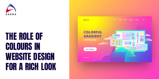
Let’s admit it- websites with dull colours are boring!
Remember the last time you hit the back button as soon as you entered an old-looking website? Yes, we get you! We are in 2024, and website aesthetics play a pivotal role in defining user experiences. Amidst the constant advancements, there’s one element that remains timeless yet dynamic in shaping how we perceive and interact with online platforms: colour. The subtle art of choosing the right palette adds life to web designs, where each shade narrates a unique component of the brand story. This very act transforms a simple visit to a website into a compelling visual symphony.
Understanding the role of colours in website design is more of an exploration than a static strategy. The right colours can elevate a brand from mediocre to monumental. At Aarna Systems, we mindfully choose suitable colours to tell our clients’ brand stories throughout their websites. Let us help you explore the importance and role of colours in website design for a rich look. Let’s begin!
Discovering the Power of Colour Palette
Vibrant Colours
Remember the bold hues that instantly draw your eye to a webpage? Exactly, these are the vibrant colours that summon emotions and invoke actions. As a leading website design company in Pune, we aim to create a memorable digital experience with a spectrum of vivid and compelling colours that reflect the ongoing design renaissance. From the deep blues suggesting reliability to the energetic reds that command urgency, the right combination forms the heart of an impactful design strategy. The goal of every web designer is to create a harmonious balance of colours that not only catch the eye but also create an emotional connection with the audience, resulting in a memorable and immersive user experience.
Colour Blocking
Colour blocking is an age-old technique that has stood the test of time. From the traditional to the modern era, web development companies in Pune have embraced this approach, creating visually striking websites. Colour blocking involves using bold and contrasting colours in unique compositions, whether through cut-out styles, colour masses, or abstract shapes. It is a testament to the innovation and interaction of aesthetics. With its ability to instantly catch the viewer’s attention and create a visually dynamic experience, colour blocking continues to be a popular choice for web designers looking to make a bold statement and stand out in a crowded digital landscape.
Colour Wheel is a Spectrum of Strategies
The color wheel is not just a tool, but a spectrum of strategies for web designers. The colours chosen for a brand’s communication and perception play a significant role in shaping its identity. Each segment of the colour wheel, from primary to complementary colours, holds the power to define a brand’s persona and enable consistent visual representation. By carefully selecting colours from the wheel, web designers can create a cohesive and distinctive visual language that accurately reflects the brand’s values and resonates with its target audience. Whether it’s using vibrant hues to evoke excitement or soothing tones to establish trust, the colour wheel provides endless possibilities for brands to convey their message and stand out in a competitive digital landscape.
Rebranding with Colours and Multicolour Backgrounds
Modern rebranding goes beyond logos—revamping colour palettes to characterize the modern zeal through gradients and graphical storytelling. It involves refreshing a brand’s visual identity to keep up with the digital zeitgeist. As users scroll through a website, the background colour augments the narrative. More than just a backdrop, it plays the lead role on stage. The website design experts harness this potential to set the tone for the whole page layout.
Typography in Contrast
Typography in contrast plays a crucial role in creating engaging and visually appealing designs. When the right balance is struck between the colour of the text and the background, typography moves from being a mere component of the page to becoming a standout element. This harmonious contrast serves a dual purpose of enhancing the overall aesthetics of the design while ensuring optimal readability.
The choice of contrast in typography is not arbitrary; it requires careful consideration. The contrast ratio between the text and background colours must be balanced to achieve optimal legibility and visual impact. A high contrast ratio ensures that the text stands out prominently, instantly capturing the viewer’s attention and directing their focus to the message being conveyed. Moreover, the contrast in typography is not limited to colour alone. It also encompasses factors such as font choice, font size, and letter spacing, all of which contribute to the overall visual contrast of the text.
The Digital Canvas of Aarna Systems for Proficiency in Website Design
With our years of experience and expertise, we have come to realize that colour is not just a component of design—it is the very essence of communication. The visual appeal and impact of a website go beyond its content and layout; it relies heavily on the skilful and strategic use of colours to bring all elements together.
For those seeking to create a captivating and visually stunning online presence, Aarna Systems is the ideal choice. With a wealth of experience in creating harmonious colour schemes, Aarna Systems stands out as an exceptional website development company in Pune. By partnering with us, you can expect web design services that not only understand the science behind colours but master the art of effectively applying them to give your website a rich, vibrant, and engaging user experience.
With Aarna Systems, you can ensure that your brand’s digital footprint is striking, evocative, and memorable. Reach out to us today and let us help your business’s true colours shine through on the digital canvas of tomorrow. Our Web Design Experts in Pune are here to help. Feel free to get in touch!


