The global pandemic Coronavirus has evoked all the business senses of entrepreneurs. People are finding ways to go online. Digital marketing has become the prime focus of businesses. Due to this wave of digital marketing, the web designing market is experiencing a great hike across the world. Most SMBs are working on getting a fantastic website during this lockdown. Indeed, it is a digitally progressive period for businesses.
Many times small-medium business entrepreneurs think if they build a website for business, their work is over. People will find them online and pop up in their stores soon. This imaginary business process hits them hard when they observe no conversion even after having an online presence. Obviously, things don’t work this way in the digital world. Even if we keep the digital marketing part aside, sometimes your website is at fault. Possibly, it is stopping your business to rise. It is not working as a channel but a hurdle for your business. You need to check what is wrong with the website. In India, a web design company in Pune or other metropolitan cities are best to give your website work assignment. They can design an attractive and user-friendly website for you in just a few days. Your website may get ready before the lockdown ends.
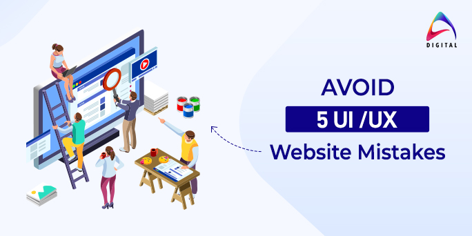
Well, relying on a website development company is good, but you need to know about web designing too. There can be many annoying mistakes on your website that leads to a higher bounce rate. People may click to visit your website, but an absurd design can kill their mood in seconds. And they hit the back button at a lightning-fast speed. Do you want this to happen to your website? A big No, right? This is why we have curated a list of top 5 irritating web design mistakes that you must avoid in your business website. Pay attention to these problems to get excellent traffic coming back to your website. Let’s check them out:
5 Website Design Mistakes that you must avoid
1. Cluttered Carousels
Suppose you visit a website. The first image is appealing and has some good content to read. You start reading it, and suddenly a new image slides in that place. Oh god! You were in the middle of reading that content. It becomes an instant turn off for many. Your visitor may get irritated after unsuccessfully reading the second image too. They may press the back button. You can’t afford to lose a website visitor as soon as they enter. Always pay attention to the appeal factor of your website’s carousels on the homepage. Never clutter it with too much content or unclear images. Keep the content minimum and prefer to give a slide option to the visitor. If Auto rotating carousels, it should have good seconds of pause.
2. Annoying Typography
Okay, typography matters. You need to see that the website typography and your business go hand in hand. A hospital website should not have ghost fonts. This is obvious and the least avoidable principle of excellent web designing. Try to use typography fonts that are smooth and easily readable. Pay attention to the text spacing between two characters.
Likewise, check the paragraph lines spacing and overall words spacing for good typography. Your website design company will take care fo the spacing & adjustments. Make sure you recheck these factors too to make your website’s content readable and appealing to the visitor’s eyes.
3. White Space Adjustments
White space is a space between text, images, blocks, and more on a webpage. Generally, white space needs to be balanced in a manner that your website should look neither too empty nor too cluttered. It can give your text/image/graphics an oomph on the site. The wise use of white space is a must. Talk to your web designer if you feel your website needs space to breathe. There is lots of information on the homepage that can be removed. Go ahead; everything needs not to be served on the platter to the visitor. They are smart; they can search for information on your website’s other pages too. Also, create a balance of white space in all pages, not just the homepage.
4. Unresponsive Website
Do you know – if your website is not mobile-friendly, you are already losing a significant portion of visitors? A responsive website is the need of today’s world. Nowadays, most of the people search online. This is why you need to treat your site visitors with a seamless, smooth website experience when browsed via – Mobile, Tablet, or any other smart device. Adjust the website content as per the device’s dimension. It helps the visitor to see the graphics, texts, and videos with zooming in or out. It’s 2020, and the need for a good, responsive website is real. Make sure your visitors can connect to you from everywhere. You can opt for AMP pages once you make the website responsive. A website that opens faster has a higher chance to rank and become a favorite website in a shorter time. Go for it!
5. Poor Website Images
Suppose you run kids learning centers and the homepage website shows a computer and desk. Is it relatable? No. Plus your visitors may perceive you as an unprofessional center they don’t need for their child. This is why images are essential. They talk a lot about your business. We being a leading web design company in Pune, encourage the quality image placement in all our projects. You must avoid using free images that are cliche now. Also, pay attention to the copyright of images. Not all images are free. Your website can be penalized or sued for misusing images with proper permission and purchase. Make use of paid images, use real high-quality images of your business office, products, teams, and more. Try to be unique and use appropriate images and icons on the website. Using good images makes your website visitors stay longer than usual. Work on it!
Final Thoughts
This lockdown is an opportunity for businesses to get started with the digital marketing journey. Begin with having a well-designed website. A good website is your goldmine. Once you get the business website ready, make sure you check all these 5 irritating mistakes. Don’t let your website ruin your business. Hire a good website design and development company in Pune or in your city to give the professional touch to your website. Discuss your website design with the team. Give them a brief about your website’s imagination. Show a few samples to the experts. It becomes easier for your web design company to fulfill the expectations. They work faster when you share insights clearly in the initial stage. The possibility of these errors is less when professionals do it. Still, remain proactive and analyze your website.
At Aarna Systems, we keep these minute yet essential factors always in check. Our team is equipped with the latest web designing, UI, and UX technologies. We believe in creating a website that is user-friendly, appealing, and highly responsive. If you wish to have a robust business website and mobile application, get in touch with us soon. We are always happy to create digital masterpieces.

